This page provides a comprehensive overview of the out-of-the-box CMS components available in the Storefront Application for your chosen provider (Contentful or Storyblok). These components are designed as flexible building blocks, empowering you to create dynamic and engaging content pages without writing any code.
Core Content Primitives
These are the most fundamental, atomic components for creating basic content.
Text
Purpose: The simplest way to add a text string. You can choose to display it as a paragraph or a heading to create a clear typographic hierarchy.
Configurable Properties: content (text), text type (dropdown).
Usage Example: This component is the foundation of all text-based content, from product descriptions to headlines.
Examples
Text, type paragraph (default)
Text, type h1
Text, type h2
Text, type h3
Text, type h4
Link
Purpose: A simple clickable link that can be used to direct users to other pages or external sites.
Configurable Properties: url (text), open in a new tab (yes, no), content (text or image)
Usage Example: Use as a standalone link or embed within other components.
Examples
This is an image link (opens in the same tab)
This is a text link (opens in a new tab)
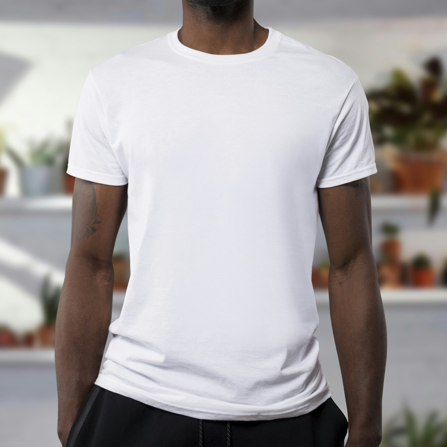
Image
Purpose: Display a standalone image. This component is designed for performance, handling responsive images and different aspect ratios out of the box.
Configurable Properties: Image Desktop (asset), Image Mobile (asset), Alt Text (text), Aspect Ratio Desktop / Aspect Ratio Mobile (dropdown).
Usage Example: Use for product photos, banners, or editorial content.
Examples
This is an image with an aspect ratio "Original"
This is an image with an aspect ratio "1:1"
This is an image with an aspect ratio "16:9"
This is an image with an aspect ratio "4:3"
Video
Purpose: Embed a video. This component automatically handles playback and responsive preview images for a smooth user experience.
Configurable Properties: Video (asset), Preview Image Desktop / Preview Image Mobile (asset), Aspect Ratio, Autoplay, Muted, Loop, Show Controls (toggles).
Usage Example: Showcase products in action or add a hero video to a landing page.
Examples
This is a video with an aspect ratio "16:9", autoplay, muted, looped, without control display
This is a video with an aspect ratio "1:1", no autoplay, muted, not looped, with control display

This is a video with an aspect ratio "4:3", no autoplay, not muted, looped, with control display
Layout & Structural Components
These are the building blocks you use to arrange your content on a page.
Section
Purpose: A versatile container for grouping other components. It’s the primary way to define distinct, full-width rows of content with unique styling.
Configurable Properties: Background Color (hex code), Background Image Desktop / Background Image Mobile (asset), Padding (dropdown), Content (reference field for nested components).
Usage Example: Use it to create a new row for a promotional banner or a hero section with a specific background.
Examples
Section with a background color, a two-column grid with an image on the left side and a heading, description and a CTA button on the right side.

Section with a background image, a description and a CTA button on the left side.

Learn more about new collection ->
New collectionGrid
Purpose: Arrange components into a responsive multi-column layout. This allows you to create structured content sections like a product gallery or a set of teasers.
Configurable Properties: Number of columns for desktop (up to 6) / Number of columns for mobile (up to 3), Gap size between columns on desktop / Gap size between columns on mobile (dropdown), Gap size between rows on desktop / Gap size between rows on mobile (dropdown), Column content (reference field for nested components).
Usage Example: Use a 3-column grid to display three teaser cards side-by-side on a desktop.
Examples

Discover a new bags collection

Discover a new sneakers collection

Discover a new shirts collection

Discover a new caps collection
Divider
Purpose: Control the vertical spacing between components. You can also use it to add a simple visual separator line.
Configurable Properties: Height (dropdown), Show Line (toggle).
Usage Example: Insert a spacer between a hero banner and a product grid to improve visual hierarchy.
Examples
Divider, small, no line
Divider, medium, with a line
Divider, large, with a line
Rich Content
These components are built upon the primitives to display richer content.
Rich Text
Purpose: A powerful text editor that supports a wide range of formatting, from basic bolding and lists to embedding images and links within the text itself.
Configurable Properties: content (Rich Text Editor Field).
Usage Example:
Bold
Italic
Underline
Unordered list
item
item
item
Ordered list
item
item
item
E-commerce Specific & Merchandising Components
These components connect directly to your product catalog, helping you merchandise your store.
Slider
Purpose: A versatile carousel that can contain any other content component as its slides. You can use it to build carousels of images, promotions, or teasers.
Configurable Properties: Content (reference field), Show Navigation Arrows (toggle), Show Pagination Indicators (toggle).
Usage Example: Create a full-width image carousel on the homepage with custom banners.
Examples


Interactive & Action-Oriented Components
Button
Purpose: A standalone, clickable button that guides users to a specific action or page.
Configurable Properties: Text (text), Style (dropdown), Url (text), OpenInNewTab (toggle).
Usage Example: A "Shop Now" button on a promotional banner.
Examples
Accordion & Accordion Item
Purpose: Organizes content into expandable/collapsible sections, ideal for FAQs, product details, or any time you need to save vertical space.
Configurable Properties: Accordion has a Title (text) and an array of Accordion Item references. The Accordion Item has a Title (text) and nested Content (reference field for other components).
Usage Example: A FAQ section on a product page to keep the page clean.
Shipping & Delivery
How long will it take to get my order? We offer a few shipping options. Our standard shipping typically takes 3-5 business days. If you're in a hurry, you can choose express shipping at checkout for delivery in 1-2 business days.
Do you offer free shipping? Yes, we do! All orders over €75 qualify for free standard shipping.
Where do you ship? We currently ship to all countries within the European Union. You can find a full list of shipping costs and estimated delivery times on our Shipping Information page.
Returns & Exchanges
What is your return policy? We want you to love your purchase. If you're not satisfied, you can return unworn and unwashed items within 30 days of delivery. All returns are free.
How do I make a return? You can initiate a return through our online portal. Simply log in to your account, find your order, and follow the steps to generate a return label.
Can I exchange an item for a different size or color? Yes! The easiest way to exchange an item is to return the original product and place a new order for the size or color you want. This ensures you get your new item as quickly as possible.
Products & Sizing
How do I find my size? You can find a detailed size guide on every product page to help you find the perfect fit. It includes measurements for our products in both centimeters and inches.
What materials are your clothes made of? We are committed to quality and sustainability. The materials for each item, along with care instructions, are listed in the product description on its page.
Do you offer plus sizes? Yes, we do! We believe in inclusive sizing for all body types. You can use our size filter on any product category page to find all available sizes.